A Beginners’ Guide to Logos
What’s In a logo? A business, by any other name, would be just as sweet…right? Perhaps Shakespeare was on to something, but then again, he wasn’t questioning the role of branding in his famous play Romeo and Juliet. A business with a “bad” logo can easily push away its ideal buyers even if their offerings are nothing short of perfect. But a good logo? A good logo has the power to pull the right people in just long enough for the rest of your marketing strategy to step in and close the deal.
But first, what even is a logo? What makes a logo good? In this beginners guide to logos, we will cover the basics of what a logo is, what it does, and how to make a good one.
SECTION ONE: WHAT IS IN A LOGO?
A logo is a visual emblem that represents a business’, organization’s, or even person’s brand. Your logo is oftentimes the first brand visual that audiences engage with, so it is good to think of you logo as your brand’s “HELLLLOOOOOOO” (or initial introduction) to your audience.
Now this is *really important*: Your logos does NOT need to tell the ENTIRE story of your business. All it needs to do is set a good foundation to grow from. With a clear story, strong visuals, and a little educational content, you can prime your audience to decide if they like you AND be ready to take in more.
Your logo has tons of opportunities to share information about your business and prime your viewer. These opportunities include:
- Typography
- Illustration
- Composition
- Color application
- Copywriting
To make a “good” logo, each of these data points should be considered carefully. Do TOO MUCH and you logo will feel overwhelming. Do TOO LITTLW and your logo will feel bland and unremarkable. So, let’s figure out how to find the *just right* middle ground. In the next two sections, we will break down how each of these opportunities can be harnessed to create a successful logo.
Pro tip: Have your brand strategy done first
The construction of your logo–whether it be minimalistic and sophisticated or maximalist and whimsical–is guided by your brand’s strategic positioning. Your brand strategy MUST be completed before you begin planning for your logos. Without strategy in place, it is impossible to navigate the never-ending possibilities of what your logo could look like.
SECTION TWO: WHAT DOES A SUCCESSFUL LOGO LOOK LIKE?
Successful logos all have a few common traits:
- They are unique and memorable
- They are clear about their purpose
- They are logistically easy to use
Logos that are unsuccessful typically:
- Are comprised only of trends or are easily confused with competitors logos
- Have too much content or too many stories trying to fit all into one suite
- Are logistically complicated to use
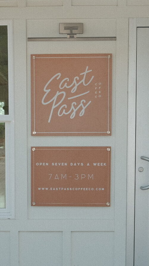
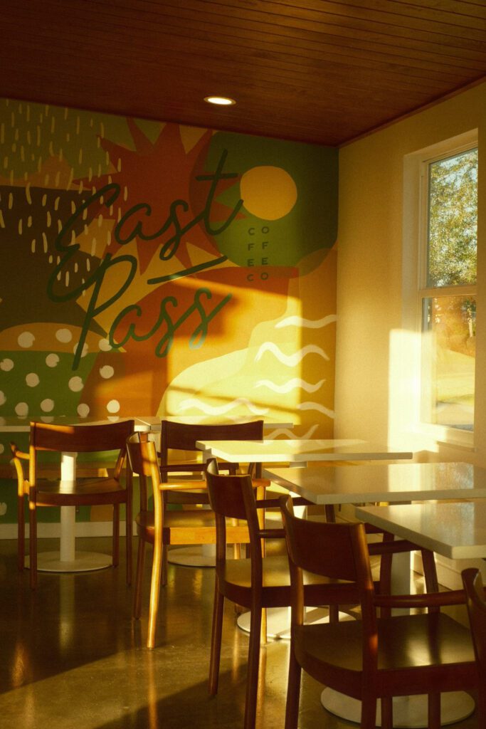
SPOTLIGHT: EAST PASS COFFEE CO.
In my humble opinion (I made these logos) East Pass Coffee Co. has a strong primary logo. Their brand strategy directed us to create logos that attract a balance of both families and restaurant workers local to Destin, and tourists who seek out “locals” experiences while on their vacation. This means we need to have an friendly, approachable brand that is the choice, every day go-to for people that value community, really good food, and supporting local.
The East Pass primary logo clearly displays key information across all of our data points:
Copywriting: The logo displays 4 pieces of key information including the full business name (East Pass Coffee Co.), the service offered by the business (An All Day Cafe), the location (Welcome to Destin’s), and the ethos of the business (local watering hole)
Typography: The key fonts are approachable and legible with a hint of mid century influence, all essential to the palatable yet elevated feel of this local’s cafe.
Illustration: The logo features two herons, classic water birds often seen in Destin’s harbor, cheers-ing EPcc branded iced coffees. The illustration expands on the “local watering hole” concept introduced in the copy and pays homage to the local feel via the herons.
Composition: The dynamic arch shape of the logo is friendly and open. Not too sophisticated, but not too simple either to say: this is an easy going place, but we really care about everything we do. Its simple, but really freaking good.
Color application: Our brand colors take inspiration from the mid-century architecture of West Coast living. Our overall brand color palette is punchy and fun and dynamic, so our logos nestle into this color palette by taking a straight forward, monochromatic approach within each logo itself. The logos are then paired with really dynamic environments that bring in all the joy of the rest of the palette.
Despite it being a slightly more content heavy primary logo, this logo has plenty of friends to help out:
*cue the full logo suite*
This is the full logo suite for East Pass Coffee Co. located in Destin, Florida. The coffee shop has access to a full suite of logos that all do different jobs for the brand identity. Some are big and educational. Some add personality and flair. Some are logstically simple to use. All together, East Pass always has the asset they need to match the context the logos is going in.
While your brand can survive with just one logo, successful logo suites are typically comprised of a handful of logos that all perform different jobs, but are cohesive in their messaging, styling, and goals. Each logo in the suite should support the other logos by reinforcing–and perhaps even expanding on–the messaging and personality of the brand.
SECTION THREE: LOGO SUITE COMPOSITIONS AND SAMPLES
“Well jeez, Bethany….now I’m stressed. I thought we were just working on one logo….now we have more?!”
Yes, but by opening up the logo suite to have different logos to complete different “jobs,” we take pressure off of the primary logo to have to be *perfect* and do too many jobs. Aren’t you stressed when someone asks too much of you? It gives you anxiety, right? Right. So why would we do that to your logo’s nervous system? We like your logo and we want it to have good mental health. So, we support her with a village.
So what are we working with? I recommend to each of my clients that we have at minimum 3 logos:
- A primary logo that serves as the “best foot forward” of your business. This logo sets the tone for your brand’s personality, and is expanded upon by all other brand assets.
- A logistically easy to use logo that is simplified and oftentimes abbreviated.
- A personality-centric logo like a brand mark, monogram, or otherwise decorative logo that reinforces the personality of the brand.
A logo suite is not limited to only 3 logos. Depending on the brand, you can have many (even up to about 9!) variations of logos. The most important thing is that they all be inter-connected by a unique, recognizable design style and cohesive central messaging.
Here are some sample logo suites to help you imagine what yours could be:
Some logo types you can consider including in your suite:
Remember, your logo suite MUST have a primary logo, and a secondary logo no matter what. But beyond that, your logos can serve a multitude of purposes. Below you will find some of the most common supplementary logo categories I have run into in my over 10 years as a designer.
DECORATIVE ROUNDEL LOGO
This logo doesn’t really add any new information to the logo suite, but rather presents existing information (like the brand name, core illustration, or other basic info) in a consumable format.
ALTERNATIVE WORD MARK LOGO
A typography-forward logo that utilizes one of our supplementary fonts or a completely custom typographical format. This logo’s job is to evoke the brand’s personality in a saturated way.
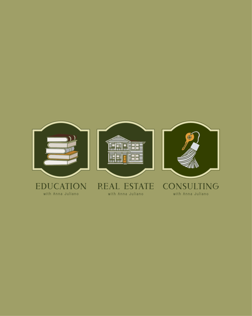
SERVICE OR CATEGORY LOGO
For businesses that have either a complex set of services or even just two services that speak to different target audiences, we can do logos that are associated with each service so as to explain to the viewer which part of the business they are engaging with at that time.
EDUCATIONAL LOGO
This logo format adds new information to the logo suite that can include the brand values, information about the target audience of the brand, an expanded or abbreviated illustration, or any other information that helps to exspand on the ethos of the brand.
BRAND MARK LOGO
A simple and identifiable illustrative mark. This is used for decorative purposes only.
TAGLINE LOGO
A logo that states the brand’s tagline in an engaging way. This is used for decorative purposes only.
MONOGRAM LOGO
Typically the initials of the business owner for a personal brand, or the acronym of the business for a larger brand.
SIGNATURE LOGO
Typically the name of the business owner for a personal brand.
PACKAGING LOGO
A logo that is specifically designed for merchandise packaging. It might include information about the product itself.
MERCHANDISE LOGO
A logo that is intended to be used for decorative purposes on brand merchandise and apparel.
SECTION FOUR: AN ACTION PLAN FOR BRINGING YOUR LOGO SUITE TO LIFE
How do we create something that is clear, unique, memorable, and logistically sound all in one? The five step process below will help us achieve all of these characteristics, and will hopefully leave us with an irreplicable logo suite that will set our business up for success.
Step One: Determine the purpose of the logo suite inspired by your brand strategy.
Step Two: Assign the roles each logo will play in your logo suite
Step Three: Establish the minimum content that must appear in each logo
Step Four: Identify design direction with a special focus on cohesion, rich symbolism, and creativity
Step Five: Design!
CLOSING
Whether you are building your logos on your own or working with a designer (maybe me!), I hope that this has helped you understand the goals of a logos, the components of a logo, and the ways logos can work together to cover every need.
To review, the best custom logos should always:
- Be unique
- Be memorable
- Be clear
They should never:
- Have too heavy of influence of trends
- Look just like your competitors
- Try to tell too many stories or do too many jobs all at once
If you need help figuring out how to tell a compelling story through your logos, contact me for a free branding consultation. Together, we will create logos that are unique, memorable, and effective.
Happy designing!


