First off, what is kerning? In typography, kerning is the word for the amount of space between each of your letters. Kerning is an important device to help your copy remain legible and can even add more personality to the fonts. When should I worry about it? With proper kerning, your fonts should look and […]

December 7, 2025
What is a glyph? In typography, a glyph is essentially a graphic shape that can represent a character, or part of a character. They can have the appearance of numbers, letters, punctuation or even a decorative form. Some fonts provide not only a standard set of letters, numbers, and symbols, but include variations as well. The term […]
December 7, 2025
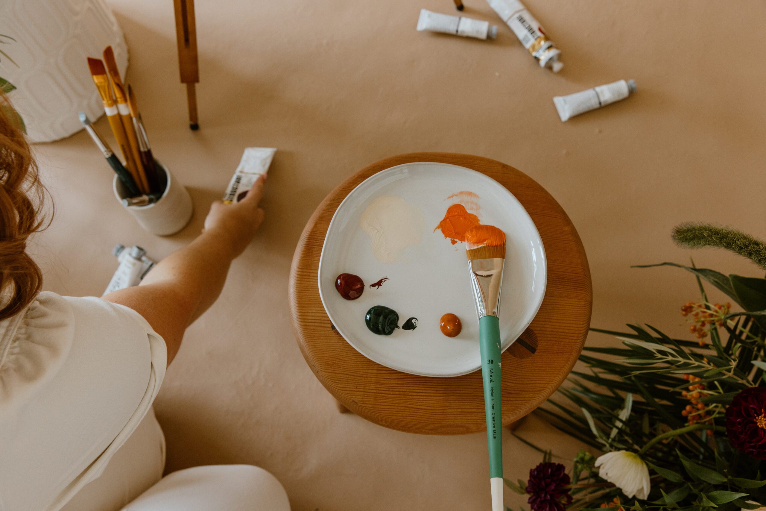
If you are reading this article, you are probably working with design files, maybe for the first time, and are wondering what the heck to do with color codes. Whether you are a client of mine, taking one of my design courses, or just a passerby, this article will cover the very basics of understanding […]
December 7, 2025
An intro guide to affiliate revenue for creative entrepreneurs with links to real programs
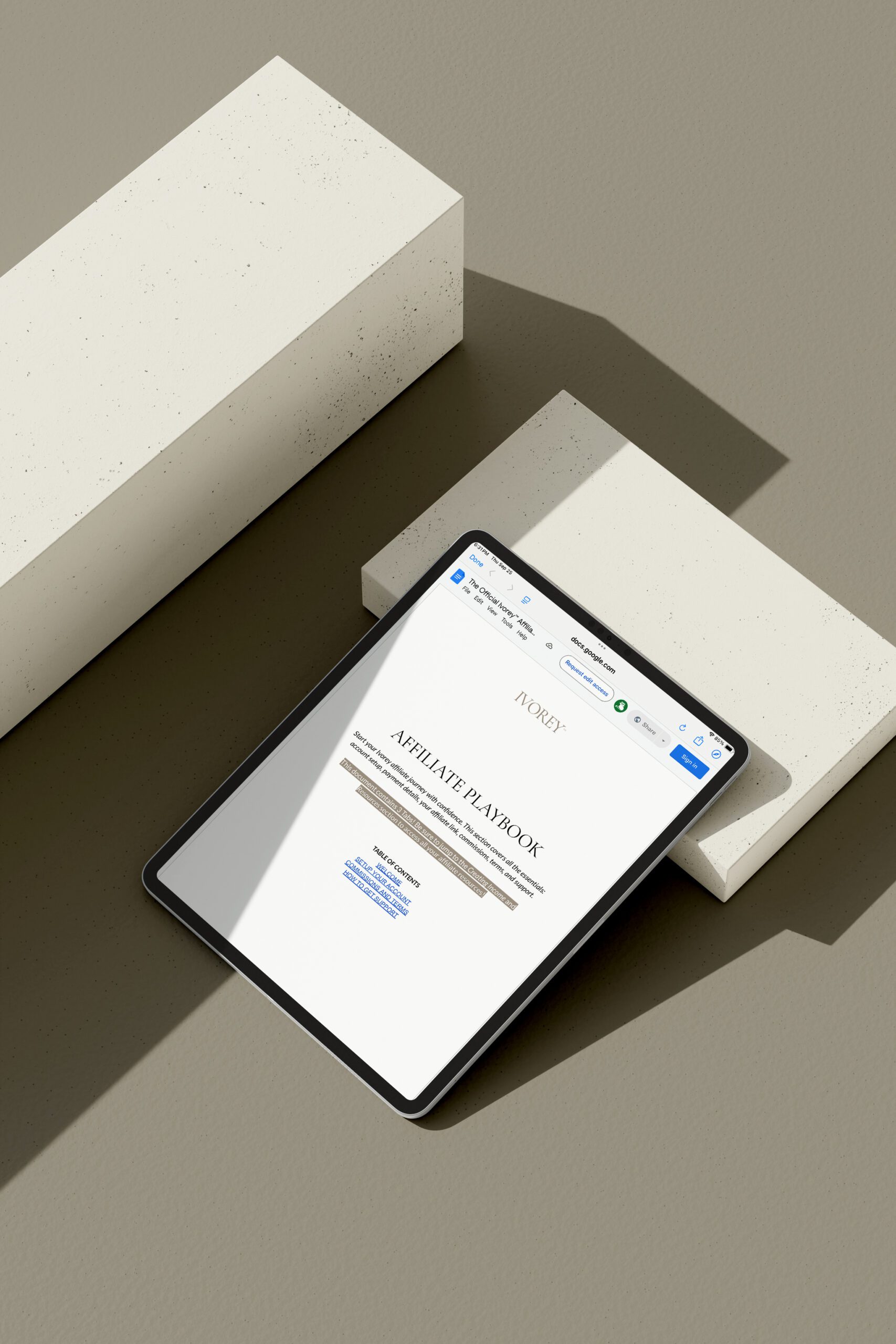
September 25, 2025
Need updated headshots but don’t have your new branding done yet? No worries. While I always recommend having your brand strategy completed before performing a comprehensive brand photoshoot, you can still get started with updated portraits or headshots AND they can still help tell your brand story. My advice? Bring props from your real life. […]
May 12, 2025
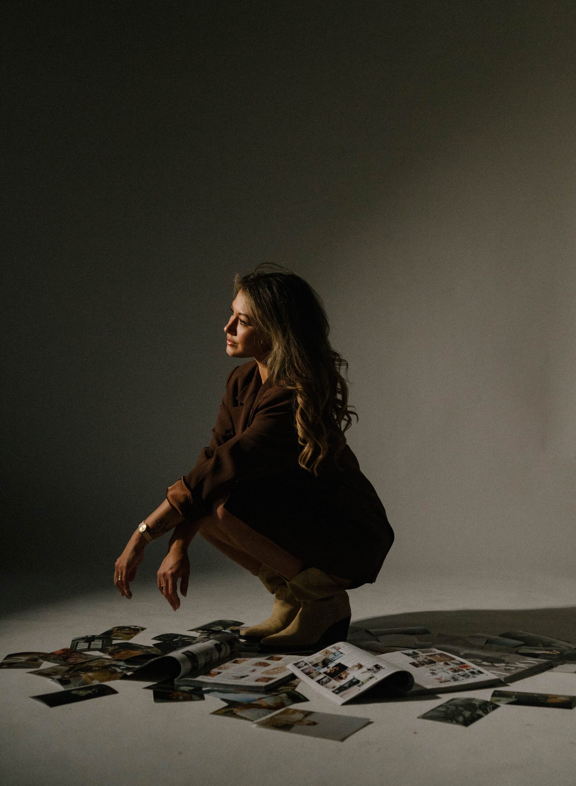
A 5 step guide to planning an irreplicable logo suite for your creative business


